An analogous colour scheme uses colours which are next to each other on the colour wheel. For example, blues and greens, or oranges and yellows. These colours have a close relationship with each other.

There is not that much hue contrast between analogous colours, so you need to make sure you are creating enough contrast using the other elements like value or saturation.
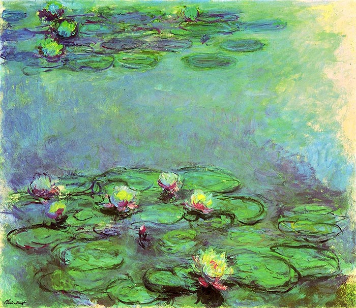
When I think of analogous colors, Claude Monet’s paintings first come to mind. In this painting, Monet used mostly blues and some greens. There is hardly any hue contrast in this painting. Monet relied more so on value and saturation contrast.

Below is one of Monet’s paintings from his water lilies series. It features all kinds of greens, blues and purples. There are some red accents used for the flowers, but I still consider this to be an analogous painting as red is not a dominant color here.

In Vincent van Gogh’s flower painting below, he used an analogous color scheme of yellows and greens. He also made clever use of line to outline the flowers.

Below is a warm analogous color scheme with mostly reds, oranges and blacks.


